|
In
this 2-part article, Dr.
Tong promotes ideas that you just won't
read anywhere else about the intimate connection
between web design and web marketing, based on
his 20 years of experience with the Internet.
|
|
|
 |
Hundreds
of thousands of websites �
even many attractive
ones � are out on the Web, but relatively few of these draw any
significant traffic whatsoever. Why?
Because these websites are not marketed
appropriately, and because they are not marketized.
I've coined the phrase, marketized website,
to indicate a website that has been designed with the following
characteristics in mind:
We'll consider each of these characteristics in turn. Then, in
Part 2 of this article, we'll
focus on a couple of important issues:
 |
why to
steer clear of the $500 websites or the "do it yourself"
websites � you get what you pay for! What is involved in designing
a website and where the costs come from. |
 |
how
to keep the cost down and the quality high � via:
1.
Good education
2. Effective division of labor
3. Cooperative communication
4. Intelligent design process
|
SITE
INTERACTIVITY
|
|
Not too long ago, our staff submitted a website to a particular
Internet search engine, and the form being filled out asked the
following question:
Indicate
if you have any of the following on your site:
- Registration
with free entry
- Subscription
fee and password
- Newsletter/contest/game
- Posting/BulletinBoard
- Promotional
Sales for Limited Time
- Search
Engine
- Shopping
Cart
- Order
Form
- 1-800
Ordering
- Credit
Card/CyberCash Payment
- Java
|
|
While not a complete list, this is an excellent
question for an Internet search engine to be asking! Why? Because
every one of these devices helps promote interactivity � the shopping
cart encourages visitors to select items; the bulletin board encourages
visitors to participate in ongoing discussions; etc. And a hip search
engine staff is going to rate higher those sites with greater interactivity
because they know: interactivity and popularity (i.e., traffic)
go hand in hand.
And
a smart website marketer knows that the greater part of most Internet
profits are comprised of repeat customers. So the smart Internet
marketer uses every means to invite visitors into an opt-in relationship
and to help to cultivate that relationship over time.
YOUR
USP-TAILORED WEBSITE
|
|
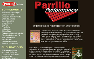
Parrillo Performance
is a company that specializes in supplements, training programs,
and literature catering to body builders and anyone who takes an
interest in significantly improving the fitness of their body. When
they came to us, their website prominently displayed their products
on the front page. And their logo had a high-tech look that works
for certain companies.
BEFORE
UPGRADE:

But
Parrillo Performance wasn't satisfied with their "Website Performance".
So they came to us. And we saw immediately what was needed: there
were many companies that sold the same general types of products,
and catered particularly to bodybuilders. But what truly made their
company and its product line unique was that it was all based on
the decades of experience of its founder, John Parrillo, gleaned
from working with the country's top bodybuilders. In short: the
company's Unique Selling Proposition
was: John Parrillo himself!
So
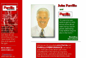
we completely re-designed the site. Every aspect of the site � from
section breakdown, to graphics, to copy, to testimonials, etc. �
was re-designed to communicate the uniqueness of John Parrillo's
ideas, and therefore, the uniqueness of his product line and services.
And � even though the primary purpose of the website is to sell
products � we downplayed the appearance of the products themselves
on the valuable web real estate that is the front page; the first
link in the sales argument chain here was to communicate the benefits
of working under John Parrillo. Most of the front page was re-dedicated
to that purpose, and, from there, to enticing visitors to this or
that link that elaborates on what John has accomplished and how
that was a benefit. But... all roads here are designed to lead to
Rome, and "Rome" in this case is the product catalog and
the order forms.
AFTER
UPGRADE:
And
of course there were the more straightforward aesthetic changes
that are simply a part of every "website makeover" that
we do: replacing that heavy (and no longer hip) black and green
color scheme with the lighter and more energetic red and white scheme.
|
I
am really impressed � the site looks great and I am very
happy. John as well. Response to the site changes has been
very strong � people have been calling in, commenting on
the improvement. As soon as we opened we made sales - starting
at a thousand dollars going up from there. Putting your
marketing program into gear will shift us into warp speed!
I have a huge list of email addresses (several hundred in
the first few weeks) of people signing up for the newsletter,
and now I've got to deliver! Everything is going really
well for us, and with the design templates and instructions
you sent, I've been able to make all kinds of changes to
the site myself � can you believe it? Thanks a million.
You have made my life a hell of a lot easier.
Steve
Hampton
Marketing
Director
Parrillo
Performance
|
What's the fundamental
lesson here? If you really want your website to become an Internet
profit center, you must spell
out throughout your website what is unique about your products or
services; you want your web designer to take your USP and communicate
it through every element of the website design.
GOOD
DESIGN / SUBLIMINAL MESSAGES
|
|
Now, you're probably thinking, "he's going to write about quick-loading
but attractive graphics, succinct, easily accessible cybercopy with
punch, a website that is highly functional, etc." Well, I'm
not � because everybody writes about that! We take this level for
granted in our design work, as evidenced by our award-winning
sites (selected by Yahoo's "Pick of the Day",
featured on MS-NBC's "The Site" program, etc.) But here
I'm going to write about things you don't
read about elsewhere.
Professional-looking, current generation website.
You have anywhere from 5 to 10 seconds to convince your visitor
to stick around and spend some more time. Because he or she is spending
time at far fewer sites than he or she is rejecting, the first thing
your visitor is applying is his or her rejection
filters, the signs your visitor is looking for to convince
him or her to move on. These are generally operating on a subliminal
level. So it doesn't matter how much great copy you have, or great
sales arguments awaiting your visitor � if any of these subliminal
buttons are pushed, many of your visitors are not even going to
wait to take a look at that copy.
The "unprofessional website"
filter. There are the obvious
things that immediately suggest "unprofessional" or "low
budget": typographical errors, an evident raggedness in the
graphic designs, and so forth. The structure of the website as well
raises red flags: there are about 4 or 5 sections that visitors
are expecting to see � they are part of an unspoken standard that
has been evolving across the entire Web community � and whose absence
often immediately signals "mom and pop store" level. And
a website that immediately throws you into a product catalog (and
which contains only a product
catalog), signals a "fly-by-night business".
The "unhip website" filter.
The indicators of a "current generation" or "state
of the art" website keep evolving, and to be displaying the
signs of an earlier generation website is a common reason for your
visitor to hit the "Back" button.
A 1950's science fiction film.
Let's look at a humorous example from another medium that will help
make the point. In the history of science fiction filmmaking, "Star
Wars" was the film that created the great divide. Every science
fiction film after "Star Wars" had to have "Industrial
Light and Magic"-strength visual effects and sound effects,
or it was guaranteed to flop at the box office. And of course, to
the post-"Star Wars" viewer sensibility, looking back
at the science fiction films of the 1950's, in which the earth looked
like a globe rather than a planet, and the strings pulling the model
rockets along were often blatantly visible � is pretty funny! But
not something that cultivates much respect.
So
if your newly created website looks like a 1950's science fiction
film, you can be sure your visitor will hit the Back button. While
it isn't nearly sufficient, being hip is
necessary.
Something
like a well-written book. A well-designed website is
something like a well-written book � the first sentence grabs you.
You don't want to put it down, until you've reached the close. And
then you want to read it again.
WEBSITE
DESIGN AND MARKETING: A SEAMLESS INTEGRATION
|
|
Consider yourself relatively well-informed web-wise if you already
know any of the following facts � most people don't. More surprisingly,
most web designers don't!
 |
The
design choices for a given web page
have a very strong impact on how high a web page is listed on
the search engines. There are over 20 distinct "pieces"
of a web page that can either be designed well or poorly relative
to search engine ranking. |
 |
Some of
the primary search engines and Internet directories are only
accepting a fraction of
the sites being submitted to them (e.g., Yahoo accepts only
2 out of every 10). Site design plays a large role in who gets
accepted. |
 |
The choices
for organizing the site into sections,
and the choices for naming the files
and file directories that comprise the website strongly
impact search engine ranking. |
 |
The choice
of your domain name impacts
virtually every marketing channel. |
 |
The
most important Internet marketing channels record your entire
history as an Internet presence;
they never forget anything. The idea, "I'll just get a
site up there, quick and dirty, and then improve it over time",
has a cost. Like a politician with a past, a website is in public
view, and your marketing efforts down the line may have to compete
with or cope with the records of earlier design or marketing
mistakes, or less than ideal communications. |
One lesson we can draw from this � if possible, choose a single
company to do (and which has the expertise and the means to do)
the design, the marketing, the upgrade, and (ideally) the hosting
of your website. Two reasons: there is a large overhead in "breaking
in" a new company; and a company that specializes in doing
the whole ball of wax will design the website from the start with
a marketing approach, and will neither let design issues outweigh
marketing issues (resulting in a pretty site that no one visits)
nor let marketing issues outweigh design issues (resulting in a
search-engine-friendly but humanly-off-putting site) � they will
instead create a marketized website
for you, that will not only attract visitors, but keep them coming
back.
|


